Seven Photo Mistakes That Kill Apartment Listings

A great apartment with bad photos sells like a bad apartment. The buyer does not see the square meters, the layout or the "move-in ready" condition: they see a dark vertical shot with a drying rack in the middle of the room. We reviewed hundreds of listings and collected the seven mistakes that come up most often. Each one has a simple fix.
Why this matters right now: supply on the secondary market is large, and buyers pick which apartment to view from dozens of options with similar prices and floor areas. The only thing that genuinely differentiates the cards in the feed is the photos. A listing with amateur shots does not just get fewer clicks. It attracts the wrong audience: people hunting for a distressed property at a discount. Fixing these seven mistakes requires no budget, only attention.
Mistake 1: vertical photos
Phones are comfortable to hold upright, so half of all listings are shot in portrait mode. The problem: a vertical frame captures a slice of floor, a slice of ceiling and a narrow strip of the room. The space looks cramped, and in listing galleries such photos get cropped or padded with ugly bars.
The fix. Shoot horizontally, always. A landscape frame mirrors how a person actually sees a room with their own eyes, and it fills the screen in every listing gallery. Portrait orientation is acceptable only for narrow spaces like a bathroom or hallway, and even there it is worth trying a horizontal shot from the doorway first.
Mistake 2: clutter in the frame
The ironing board, cables, fridge magnets, shampoo bottles on the tub rim, the cat's bowl. Every small object steals attention from the apartment itself. The buyer ends up studying someone else's life instead of the layout, and the property reads as smaller and "tired".
The fix. Before shooting, walk the room and remove everything smaller than a chair. Countertops and windowsills should be empty, with at most a vase or a couple of books. If you physically cannot clear the space, for example when tenants still live there, remove the clutter from the photos with AI. Just never retouch defects: removing socks from the floor is fine, hiding a water stain is not.
Mistake 3: dark rooms
Shooting in the evening under a single ceiling light turns any apartment into a cave: yellow walls, black windows, noisy shadows. A dark photo subconsciously reads as "troubled housing", even when the renovation is fresh.
The fix. Shoot during the day, ideally on a bright overcast morning: soft light without harsh shadows. Open every curtain and blind, and switch on all the lights even in daytime: it evens out the illumination. If the shots still come out dark, run them through AI enhancement: automatic light and white balance correction lifts an "evening" shoot to daylight quality.
Mistake 4: ultra-wide lens distortion
The 0.5x mode is tempting: the whole room fits in the frame and looks huge. But the ultra-wide angle bends walls into arcs, stretches corners and makes a six-square-meter kitchen look like a ballroom. The buyer arrives at the viewing and feels deceived: everything is smaller in person. A disappointed buyer does not negotiate, they leave.
The fix. Shoot with the main camera (1x), from a corner of the room, at chest height. If you truly need a wider view, use a moderate one (0.7-0.8x if your phone allows it) and hold the phone perfectly upright so the vertical lines of the walls stay vertical. An honest frame sells twice: first the click, then a viewing without disappointment.
Mistake 5: the details everyone notices
The toilet lid up: a classic. Also on the list: an unmade bed, open wardrobe doors, dirty dishes in the sink, an overflowing trash bin, crumpled towels. These details occupy 2% of the frame and 80% of the attention. In listing comments people discuss them more actively than the price.
The fix. A checklist before pressing the shutter: toilet lid down, bed made, doors and drawers closed, sink empty, towels hanging straight, trash bin out of frame. It takes three minutes and separates a professional card from an amateur one.
Mistake 6: the wrong photo order
First photo: the building entrance. Second: the window view of a parking lot. Third: the bathroom. The buyer closed the card before ever reaching the beautiful living room. The order of the photos is the script by which a person "walks through" the apartment.
The fix. Build the gallery like a guided tour. First frame: the most flattering room, usually a bright living room or open kitchen. Then: kitchen, bedrooms, bathroom, hallway, balcony. At the end: the floor plan, the courtyard, the entrance, the window view. The cover photo decides the click, so choose it separately: a bright horizontal frame with clear geometry and a lived-in mood.
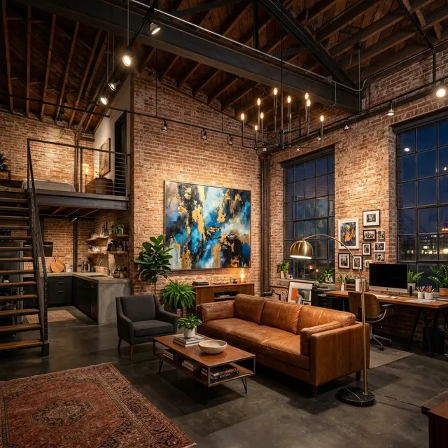
Mistake 7: empty rooms with no staging
An empty apartment does not look spacious in photos, it looks lifeless. The buyer has nothing to anchor to: the scale is unclear, it is hard to tell if furniture will fit, and there is no emotion. Bare-shell cards lose to furnished ones even at a better price.
The fix. Virtual home staging. AI will furnish your photos in 30 seconds: you get a tidy interior that switches on the buyer's imagination. Label the frames "design visualization" and keep a couple of real photos for honesty. Full breakdown here: AI home staging.
What to do with listings that are already live
The good news: you can fix the mistakes without a reshoot. Dark frames get lifted by AI light correction, clutter disappears with digital decluttering, empty rooms get furnished with virtual staging, and the photo order changes in a couple of clicks in the platform dashboard. Start with the cover: swapping the first photo for a bright horizontal frame is the fastest improvement with the most visible effect. Then walk the gallery with the checklist below. Platforms reward refreshed listings: changing the photos often gives the card a temporary boost in the feed, so the effect is doubled.
The pre-publish checklist
Save this and run through it for every listing:
- Every frame is horizontal.
- Shot in daylight, curtains open, all lights on.
- Main camera (1x), phone held upright, chest height.
- Countertops, windowsills and floors are free of small objects.
- Toilet lid down, bed made, doors closed.
- First photo: the best room. Order: a tour through the apartment.
- Empty rooms are virtually staged and labeled as visualizations.
- No defects hidden: retouching clutter is fine, retouching problems is not.
Seven mistakes, zero budget needed to fix them: a phone, daylight and a couple of tools cover everything.
One last tip: look at your card through the buyer's eyes. Open it on a phone, in the same feed where it competes with the neighboring listings. If your cover does not stand out among the ten next to it, go back to the checklist. We covered the full shooting technique in a separate guide: how to shoot an apartment on your phone.
Bring your card up to studio level. Upload your shots to Progon: light, order and staging in 30 seconds: enhance photos free.